top of page


Tanadoori Yokoo-Themed Calendar


January
February


March
April


May
June


July
August


September
October


November
December
Cake Shop Branding


Mockup


Ideation Process

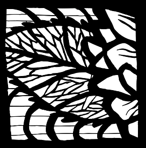
My inspiration-Tanadoori Yooko
I wanted to explore this artist's style. In this piece, he merges a newspaper (black and white/realistic) style and a playful/colorful style into one piece.


1). Use multiple layers to create clean lines and patterns

3). Play with the colors and placement of the drawing. Copy and paste some layers and shift left to create more movement.
2). Create a layer beneath all of the other layers to fill with the base with color.

1). Draw the school bus.

3). Add a background gradation. The furthest brack is brightest, and it gradually gets darker towards the front. THis creates more depth.

2). Add the basic details, such as the road and the background pattern.

4). Add orange clouds and blend the colors using the Mixer Brush Tool. Add various tones of orange lines in the foreground, getting thinner as it is further back.
School Planner Cover


.jpg)
Ideation and process:
The purpose of this project was to represent the Highschool by incorporating the school colors, mascot, and Al Mater for the 2022-2023 school year planner cover. First, I sketched the idea and format in my sketchbook. Then, I created the figures and letters with polymer clay. Finally, I laid everything out of a green felt background and took multiple pictures. Afterwards, I put the photos I took onto Photoshop to add hand-drawn details.
Wellness Posters


Ideation and Process:
I created wellness poster for a local school so that students can feel at ease when on campus. There are tips and advice on how one should live their life at school so they could cope with their stressors. First, I gathered colors, fonts, and designs that I thought would be useful to incorporate into the posters. Next, I created multiple grid layouts and chose the three I thought looked best. Finally, I created the posters on Illustrator and wrote the necessary information in each grid.
Felt Cut Design and Mockup

![IMG_2303[2169].jpg](https://static.wixstatic.com/media/5b0c12_3a445bed3fea475a9573427c74102dee~mv2.jpg/v1/fill/w_367,h_361,al_c,q_80,usm_0.66_1.00_0.01,enc_avif,quality_auto/IMG_2303%5B2169%5D.jpg)
![IMG_2304[2167].jpg](https://static.wixstatic.com/media/5b0c12_268aef751c4f40ff91fc54ed4caf6d15~mv2.jpg/v1/fill/w_363,h_356,al_c,q_80,usm_0.66_1.00_0.01,enc_avif,quality_auto/IMG_2304%5B2167%5D.jpg)


Ideation and Process: I created a Japanese kimono-inspired pattern and shaped it into a square to make coasters. First, I drew out my design idea on illustrator and made sure the pathway of the lines are clean so that the laser cutter can easily follow my pattern. Next, I downloaded my design as a svg to the laser cutter and had it cut out the pattern into thick, red felt. I also created mockups on tags and wrapping paper to create my own brand, "MY MONO," meaning "My Stuff."
Music Festival Goods


Ideation and Process: I created
mockups to sell at a Spring Music Festival.
I started out by choosing my color scheme
and making my logo. Next, I brainstormed
ideas that would implement the idea of
music in a creative manner into my
designs. I ended up creating a tote bag,
t-shirt, hat, and a mug cup, as I believe
these products are all commonly sold
and bought as merchandise at events.
Music Festival Poster

Woodcut


Ideation and Process: I created a poster to go with the Music Festival. I created a mood board, consisting of the fonts I want to incorporate, the name of the festival, the purpose of my poster, the colors I plan to use, as well as words that explain the overall mood I am trying to portray. I used my product designs as inspiration for my poster, because I wanted the theme and vibes to match. I experimented with various colors for the background of the sakura tree, and decided to choose yellow, as it portrays a vibrant, positive mood. It also enhances the beautiful pink color of the sakura flowers.
Wood Cut Design


Ideation and Process: I designed a wood cut design to make some home decor items and donate to a charity organization that helps victims of domestic violence. I decided to create a large sunflower because I want my design to evoke a sense of warmth and safety for the victims. I made digital thumbnail sketches of my design and created a series of 3 square panels. I created one illustrator document with three separate art board, each artboard measuring 11 in by 11 in. Finally, the design was cut out into wood with a laser cutter and made into a tangible product.
Mindfulness Poster

Ideation and Process: I made a wellness poster for a local high school so that they could hang this up in their classroom and feel a sense of peace and comfort. I used light, pastel colors and illustrations of relaxed animals so that students could remember to slow down and relax in their busy, overwhelming school lives.
Dog Print Sock Pattern

![IMG_2308[2173].jpg](https://static.wixstatic.com/media/5b0c12_20f70dcd0b8e410397e9c815444af6e3~mv2.jpg/v1/fill/w_406,h_583,al_c,q_80,usm_0.66_1.00_0.01,enc_avif,quality_auto/IMG_2308%5B2173%5D.jpg)
Ideation and Process: I created some illustrations of my pet dog on Photoshop and decided to create a product out of it. I printed out my illustrations and used a dye sublimation to print out my design onto a pair of socks. I decided to make the hearts shades of my dog's fur because whenever I see this color, I remember my dog's fun, friendly personality.
Sticker Pack Design


Ideation and Process: I designed my own emoji stickers on Adobe Illustrator and printed them out on sticker paper. I then designed the top portion of the package, labeling it with the Sticker name, logo, and description. As for the packaging, I placed the stickers into a cellophane bag and sealed the package by stapling the sticker pack top I had designed earlier to the top of the bag.

Poster Design

Ideation and Process: I designed a poster using Adobe Photoshop for an art competition with the theme of "Moon." "月" is the kanji that signifies "moon." On the poster, I wrote, "つきあって," which signifies the gathering and connecting of a group of people. However, I replaced "つき" with "月" as a way to symbolize how the moon is one way in which we all connect- Wherever and whenever, whoever and whatever, we are always looking at the same moon... and that same moon is looking right back at us.
Matsuri Poster Design

Ideation and Process: I designed this poster using Adobe Photoshop for an art competition to advertise the upcoming Matsuri event. I used the same illustration as the previous poster design but added an element of festivity through the use of vibrant patterns, a shift in background color, and the addition of glowing lanterns.
bottom of page